Behind the Art & Acoustic Design: Watercolor Seasons & Pentatonic ASMR
Why does playing Triple Match Relaxed feel like stepping into a quiet mountain tea house? In this behind-the-scenes look, our art and audio directors share how traditional East Asian watercolor techniques and pentatonic acoustic engineering work together to soothe the senses.
1. The Musical Secret of Pentatonic Wind Chimes
In conventional puzzle games, repetitive sound effects quickly cause "listener fatigue." When a player taps dozens of tiles per minute, a fixed high-pitched beep becomes grating, forcing many players to mute their device entirely.
To solve this, our audio team engineered an interactive soundscape built on the Major Pentatonic Scale (C – D – E – G – A) combined with natural acoustic instruments: bamboo wind chimes, ceramic celesta bells, koto plucked strings, and wooden blocks.
- Zero Dissonance by Design: Unlike the standard 7-note diatonic scale, the 5-note pentatonic scale removes semitone intervals (such as the fourth and seventh degrees) that create musical tension. As a result, no matter how quickly or randomly you tap tiles on the board, every consecutive note harmonizes effortlessly with the background ambience.
- Tactile Ceramic & Wood Foley: Every tile selection blends two distinct acoustic layers: a warm, low-frequency wooden tap (simulating a carved mahogany tile lifted from a table) and a soft, resonant harmonic overtone when three tiles merge in the tray.
- Dynamic Environmental Layers: Beneath the interactive tile notes flows a continuous binaural environmental bed featuring distant mountain streams, rustling bamboo leaves, and soft afternoon rain.
2. Four Seasons Watercolor Art Direction
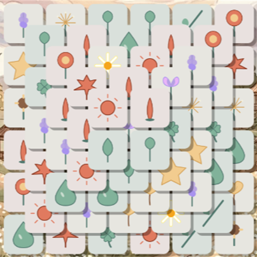
Visual clutter is the enemy of cognitive relaxation. When designing the tile motifs and background sanctuaries for Triple Match Relaxed, our illustrators avoided harsh neon gradients and high-contrast comic outlines. Instead, every visual asset follows a Soft-Edge Botanical Watercolor philosophy.
🌸 Spring: Cherry Blossom Dawn
Inspired by misty Kyoto gardens at sunrise. Features warm ivory paper textures, soft sakura pinks, celadon greens, and drifting cherry petals accompanied by morning birdsong and gentle wind chimes.
🎋 Summer: Bamboo Rain Sanctuary
Set beside a tranquil lotus pond during a warm summer shower. Combines deep jade tones, emerald bamboo stalks, and soothing acoustic rainfall on lotus leaves.
🍁 Autumn: Golden Maple Courtyard
Warm amber, ochre, and vermilion maple leaves drifting across weathered stone lanterns. Designed with low-blue-light warm hues ideal for evening relaxation before sleep.
❄️ Winter: Silent Snow Pavilion
Minimalist ink-and-wash snowscapes with soft indigo twilight skies, camellia blossoms in the snow, and crystalline glass chime harmonics.
3. High-Legibility Tile Iconography for Eye Comfort
When a board holds over 120 stacked tiles, effortless visual recognition is essential. Each tile symbol in our catalog undergoes a strict three-stage legibility test:
- Silhouette Distinctiveness: Every motif—whether a teapot, origami crane, lotus blossom, or paper lantern—has a unique outer silhouette so your brain can identify it without straining to read tiny details.
- Warm Ivory Ceramic Framing: Tiles rest on a matte, warm-ivory base (`#FDFBF7`) rather than pure blinding white (`#FFFFFF`), eliminating screen glare during extended play sessions.
- Subtle Depth Shadows: Lower-layer tiles receive a gentle ambient occlusion tint, allowing you to instantly distinguish selectable top-layer tiles from covered lower-layer tiles at a single glance.
4. The Mindful Wallpaper Sanctuary & Seasonal Postcards
As you progress through stages and earn Golden Stars, you unlock full-screen watercolor artworks inside the Mindful Wallpaper Sanctuary. Each artwork is accompanied by a short contemplative reflection or haiku-inspired quote in 18 languages, allowing you to export and save serene, watermark-free wallpapers for your phone, tablet, or desktop.